When you configure evaluations, you can analyze evaluation results to gain insights about your model performance. A dashboard provides the tools for reviewing performance details, sharing information about alerts, or printing reports.
Some of the details you can review from the Insights dashboard include:
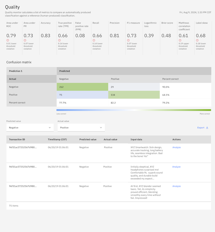
- Review quality results to see a confusion matrix that helps you determine whether your deployed model analyzed your transactions correctly.
- View drift results to see the transactions that are responsible for a drop in accuracy, a drop in data consistency, or both.
- Inspect model health evaluation results, where you can see a summary of the metrics that are generated during your last evaluation with scorecard tiles that correlate with different dimensions.
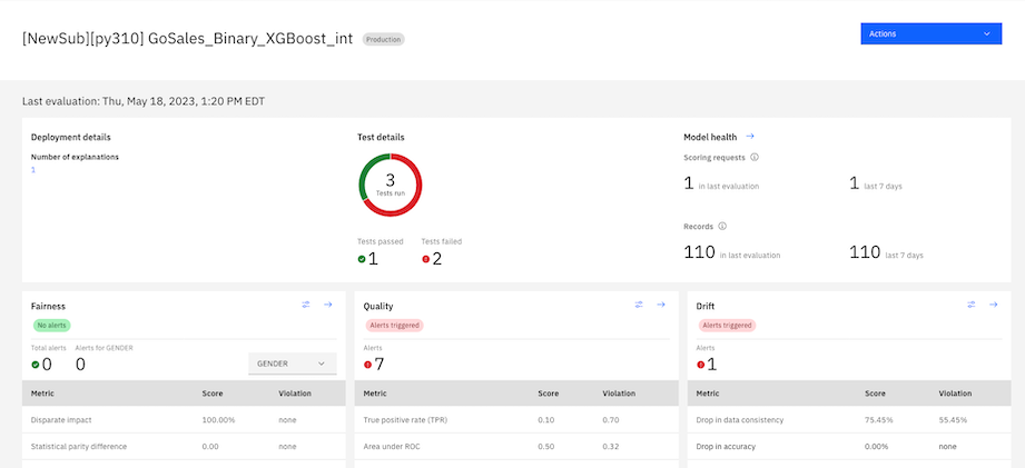
To view results in the Insights dashboard:
-
In Watson Openscale, click the Activity icon
 to open the Insights Dashboard.
 -
Select the deployment model tile you want to view results. The results from your last evaluation are displayed.
-
Click the arrow
 in an evaluation section to view data visualizations of evaluation results within the timeframe and Date range settings
that you specify. The last evaluation for the timeframe that you select is also displayed during the associated data range.
 -
Use the Actions menu to view details about your model by selecting any of the following analysis options:
- All evaluations: For pre-production models, display a history of your evaluations to understand how your results change over time.
- Compare: Compare models with a matrix chart that highlights key metrics to help you determine which version of a model is ready for production or which models might need more training.
- View model information: View details about your model to understand how your deployment environment is set up.
- Download report PDF: Generate a model summary report that provides which gives you all of the metrics and the explanation for why they were scored the way they were.
- Set up alert: Send alerts about threshold violations to an email address.
You can also use the Actions menu to manage data for model evaluations. For more information, see Sending model transactions.
With time series charts, aggregated evaluations are displayed as data points that you can select to view results for a specific time. The timestamp of each datapoint that displays when you hover on time series charts does not match the timestamp of the latest evaluation due to the default aggregation behavior.
The following sections describe how you can analyze results from your model evaluations:
Reviewing fairness results
To help you review fairness results, calculations for the following types of data sets are provided:
- Balanced: Balanced calculation includes the scoring request that is received for the selected hour. The calculation also includes more records from previous hours if the minimum number of records that are required for evaluation was not met. Includes more perturbed and synthesized records that are used to test the model's response when the value of the monitored feature changes.
- Payload: The actual scoring requests that are received by the model for the selected hour.
- Training: The training data records that are used to train the model.
- Debiased: The output of the debiasing algorithm after processing the runtime and perturbed data.
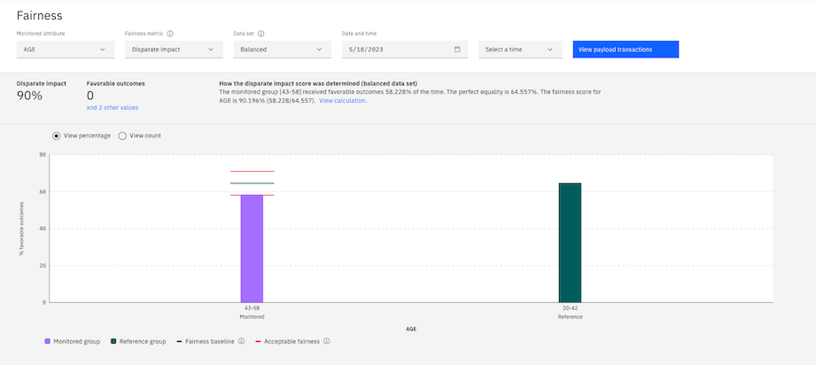
With the chart, you can observe the groups that experience bias and see the percentage of expected outcomes for these groups. You can also see the percentage of expected outcomes for reference groups, which is the average of expected outcomes across all reference groups. The charts indicates the presence of bias by comparing the ratio of the percentage of expected outcomes for monitored groups in a data range to the percentage of outcomes for reference groups.
The chart also shows the distribution of the reference and monitored values for each distinct value of the attribute in the data from the payload table that was analyzed to identify bias. The distribution of the payload data is shown for each distinct value of the attributes. You can use this data to correlate the amount of bias with the amount of data that is received by the model. You can also see the percentage of groups with expected outcomes to identify sources of bias that skewed results and led to increases in the percentage of expected outcomes for reference groups.
Reviewing quality results
To help you review quality results, a confusion matrix is displayed to help you determine whether your deployed model analyzed your transactions incorrectly. For binary classification models, the transaction records are classified as false positives
or false negatives and as incorrect class assignments for multi-class models. For binary classification problems, the target category is assigned to either the positive or negative level. The confusion matrix also
displays the percentage of positive and negative transactions that are analyzed correctly. To identify correctness, the matrix also highlights the categories of transactions with color shades of green and blue to indicate the levels of the
most or least correct categories. You can use the Predicted value and Actual value menus to specify the category of transactions that you want to analyze.
Reviewing drift results
For drift evaluations, you can view the transactions that are responsible for a drop in accuracy, a drop in data consistency, or both. You can also view the number of transactions that are identified and the features of your model that are responsible for reduced accuracy or data consistency.

For more information, see Reviewing drift transactions.
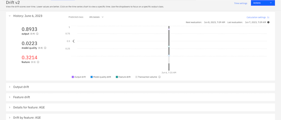
Reviewing drift v2 results
When you review drift v2 evaluation results, collapsible tiles are displayed that you can open to view different details about the metrics. You can view the history of how each metric score changes over time with a time series chart or view details how the scores output and feature drifts are calculated. You can also view details about each feature to understand how they contribute to the scores that are generated.
Reviewing model health results
When you review model health evaluation results, a summary of the metrics that are generated during your last evaluation is provided with scorecard tiles that correlate with different dimensions. For metrics with multiple dimensions, you can click a dropdown menu on the tiles to select the metric that you want to analyze. To analyze how your metrics change over time, you can click the collapsible tiles for each category to view timeseries charts.
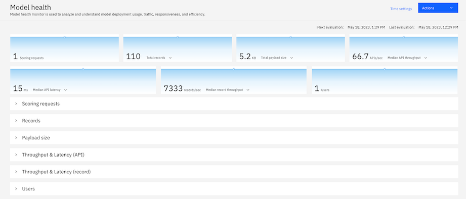
For more information, see Model health evaluation metrics.
Parent topic: Reviewing model insights