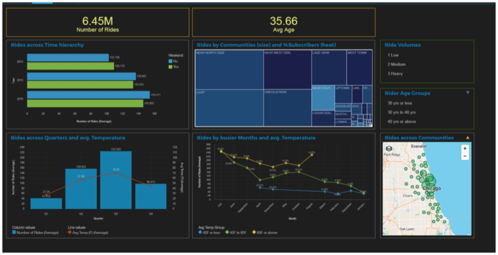
You can use the Cognos Dashboards editor to build visualizations of your analytics and results and communicate these insights using a dashboard.
On 11 April 2024, you can no longer provision an instance of the Cognos Dashboards Embedded service. However, any existing dashboards that you created with the Cognos Dashboards Embedded service will continue working until 30 September 2024. You can use Cognos Analytics on Cloud On-Demand as a replacement for Cognos Dashboards Embedded. For more information, see IBM Cognos Analytics Pricing Plans.
- Required service
- Cognos Dashboard Embedded (deprecated)
- Data format
- CSV files with comma (,) delimiter
- Data in tables in Db2, Db2 on Cloud, Db2 Warehouse, IBM Cloud Databases for PostgreSQL, PostgreSQL, and Microsoft SQL Server
Important: Data sources that are for file storage, for example, IBM Cloud Object Storage or Box, are not supported.
- Data size
- Any. Columns in CSV files can be only 128 characters long.
For more information on choosing the right tool for your data and use case, see Choosing a tool.
The dashboards editor provides a graphical builder for a line-of-business user to begin investigating data for patterns and insights. You don't need to understand coding or SQL to explore the data and gain insights. You can share the results with other users both within your organization and externally through a URL link. Alternatively, you can hand off the dashboard to a data scientist for deeper analysis and predictive modeling.

Adding a dashboard to your project
Watch this short video to create a dashboard, view, and use data in customized visualizations, and save and share the dashboard.
This video provides a visual method to learn the concepts and tasks in this documentation.
-
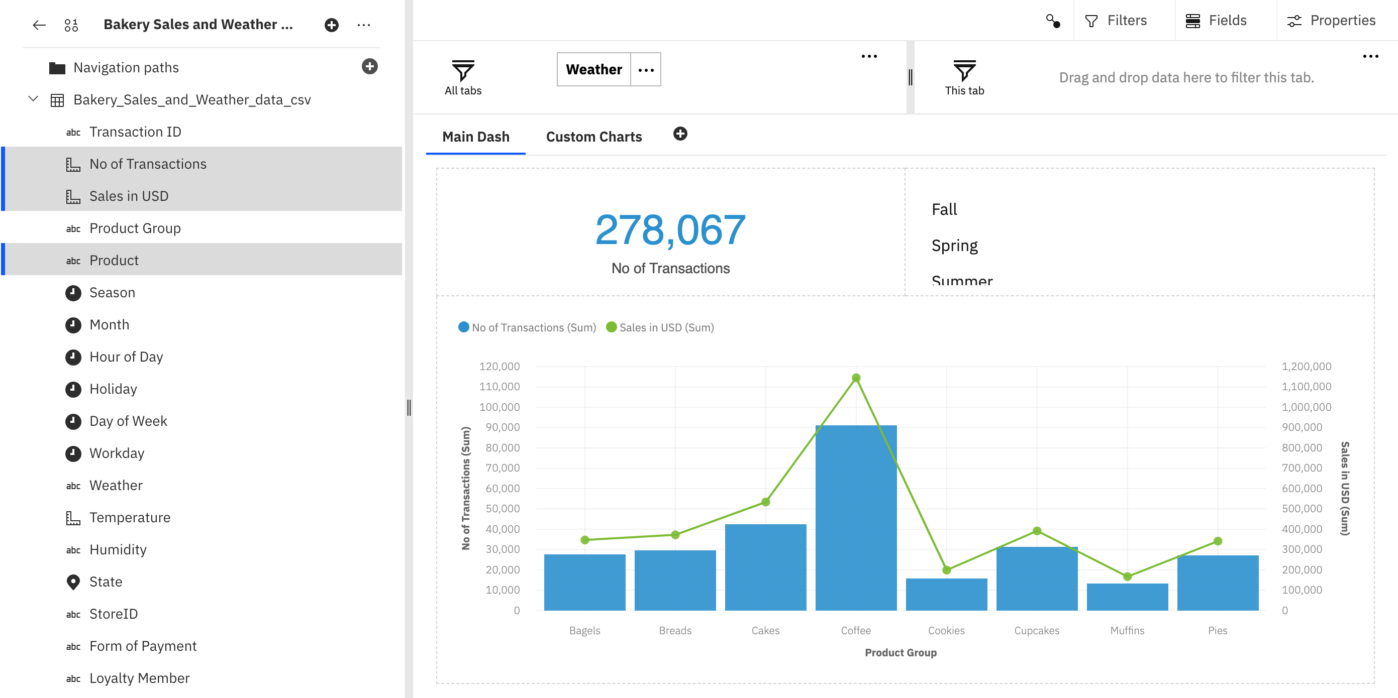
Video transcript Time Transcript 00:00 In this video, you'll see how to create and share a dynamic dashboard in watsonx.ai Studio (Watson Studio). 00:06 Business analytics dashboards provide a great way for line-of-business users to begin investigating data for patterns and insights before handing off to data scientists for deeper analysis and predictive modeling. 00:21 Business analytics dashboards inside watsonx.ai Studio (Watson Studio) provides analysts with an easy-to-use, drag-and-drop authoring tool without the need to understand coding or SQL. 00:34 The dashboard is completely interactive, allowing line-of-business users to explore the data using a variety of charts and tables and home in on areas of greatest interest. 00:48 This functionality is enabled using IBM Cognos Dashboard Embedded, a new service available in the IBM Cloud catalog, which allows developers to embed the dashboarding capabilities of Cognos Analytics into their applications using a set of Javascript APIs. 01:07 Start in a project where you want to create the dashboard. 01:12 First, view the data set. 01:16 In this case, it's a CSV file containing information about bakery sales. 01:24 Now, add to the project a dashboard. 01:29 Just provide a name for the dashboard and then select a Cognos Dashboard Embedded service instance. 01:37 If you don't already have an instance associated with this project, you can associate the service right from here. 01:45 When you're ready, create the dashboard. 01:49 This example will show a dashboard based on the three-section template. 01:57 Now, select the data source, which is the bakery sales CSV file from the project. 02:05 Great! 02:08 Now, if you expand the CSV file source, you'll see all of the columns from the data set. 02:15 You can open the data tray to see a preview of the data. 02:22 Now, you're ready to add data to the sections by dragging columns from the left into a section. 02:29 In this case, the "Number of transactions" column. 02:32 Notice the icon indicating that if you drop the column inside that icon, then the data will fill the section. 02:41 You can Ctrl-click to select the "Number of transactions", "Sales in USD", and "Product group" columns and drag them together and drop them into a section. 02:55 Here, the dashboard service looks at the selected columns and determines the best way to display the data. 03:01 In this case, it's a line and column chart. 03:05 But you can always change the visualization, if you prefer a different chart type. 03:10 Each chart has a set of customizable properties, such as: the color palettes, grid lines, access elements, and labels. 03:25 Drag the "Season" column into the last empty section. 03:29 You can see the dynamic dashboard, even in the authoring tool, by selecting different seasons from the list and seeing the other sections change. 03:42 Let's name this tab "Main Dash" and then create a second tab using the four-section template. 03:53 Show the "Visualizations" panel and drag a bar chart onto the top left section. 04:01 This chart will show the number of transactions for each promotion by season. 04:10 Next, make a scatter plot showing the number of transactions versus the dollar value in a given month. 04:25 Suppose you want to investigate the relationship between the product group and sales, but color the chart by the season. 04:33 This way, you'll get greater insight into the seasonal effects on the various products. 04:41 Right now, this chart is showing the total sales. 04:45 But it would be interesting to see the average sales per season. 04:50 Note that you can also create your own calculation. 04:54 There's one empty section. 04:58 So, drag the "State" and "Number of transactions" columns into that section. 05:03 The obvious choice, given the data in those columns, is a map visualization. 05:10 Taking a quick look at the chart options, you can see the location uses the "State" column and the location color uses the "Number of transactions" column. 05:20 That looks pretty good. 05:23 But let's change a few properties in this chart, namely: suppress the legend and remove the automatic zoom. 05:35 Note that you can change other properties here and add a chart title. 05:42 You can also change the properties for the whole dashboard, like: changing the theme and background color. 05:50 Dynamic dashboards mean that you can create custom linkages across all parts of your visualizations. 05:58 By default, all of the assets in a single tab are linked. 06:02 So, you can select a month on the scatter plot and see the data for promotions in that month. 06:09 Click the filter icon to see which filters have been applied and remove filters. 06:15 You can add filters for the dashboard users to interact with the charts. 06:20 Filters in the top, left section will be available for all tabs. 06:24 So, add the "Weather" column there. 06:27 And filters in the top, right section will be available on this tab only. 06:32 So, add the "Seasons" column there. 06:35 Note that you can also add the filter to the canvas, if you'd like. 06:40 The second tab just needs a name and you're done with this tab. 06:46 Now, you're ready to save the dashboard and then share it. 06:51 Check the option to share the dashboard with anyone who has the link and then copy the link. 06:58 Here's what the dashboard looks like at that URL. 07:02 You can see that it's completely interactive. 07:05 So, you can select a season to see that change reflected in the rest of the charts. 07:10 Take a look at the custom charts tab. 07:14 Select "Mailed coupon" to see the data for the just that promotion. 07:20 If you hover over any of the chart elements, you'll see the underlying data. 07:26 And you can see the sales from promotions based on the weather or season. 07:35 So, you can see how quickly and easy it is to create dynamic dashboards with watsonx.ai Studio (Watson Studio). 07:42 Find more videos in the Cloud Pak for Data as a Service documentation.
To add a dashboard to your project:
-
Click New asset > Visualize data in dashboards. You can create a blank dashboard or upload a dashboard file from your file system. The dashboard file must be a .json file.
-
Type a name and description for your dashboard.
-
Select a Cognos Dashboard Embedded service instance. If no Cognos Dashboard Embedded service is associated with the project, you can provision a new service instance or associate an existing instance directly from the New dashboard page. Save your settings.
-
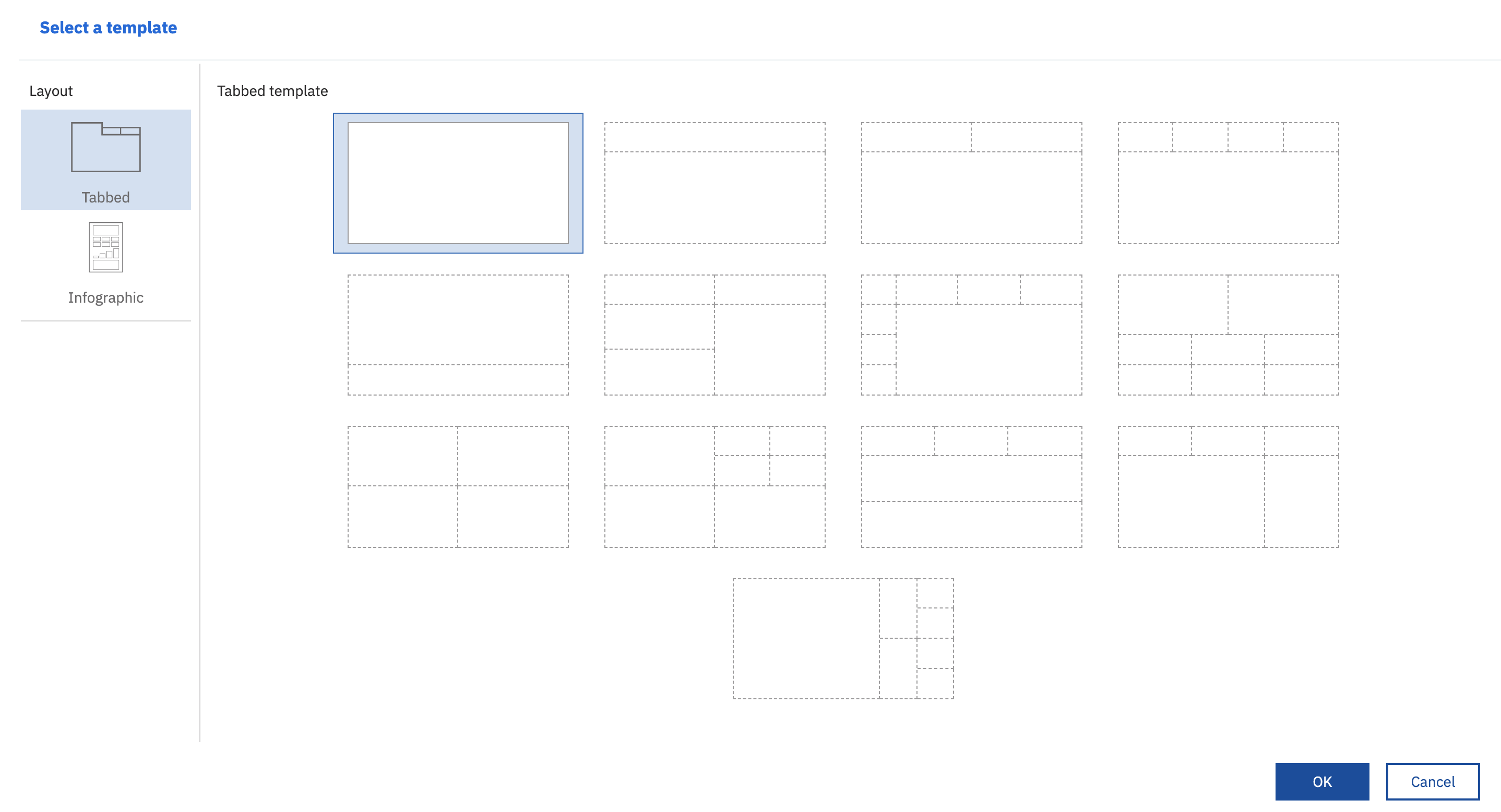
Select a template, or accept the default, and a new empty dashboard opens.

-
Create visualizations of your source data by using the following options in the left pane of the dashboard:
-
Sources: Enables selecting a data source connection. The data source must exist and have been added as a data asset on the Assets page of the project, see also Known issues for dashboards. The following data sources are supported:
- CSV files with comma (,) delimiter.
Important: Data sources that are for file storage, for example, IBM Cloud Object Storage or Box, are not supported.
- Connection to or data from Db2, Db2 on Cloud, and Db2 Warehouse
- Connection to or data from IBM Cloud Databases for PostgreSQL and PostgreSQL
- Connection to or data from Microsoft SQL Server
- CSV files with comma (,) delimiter.
-
Visualizations: Opens many different types of graphs that you can use to visualize the data from the selected data source connection. Drill down into your source connection and select the data segments you want to visualize.
-
Widgets: Enables adding widgets such as text, media, web pages, images, and shapes to the dashboard. You cannot add your own custom widgets to use in a dashboard.

-
-
Click the Save icon to save your dashboard. The dashboard that you created is listed in the Dashboards section on the project's Assets page.
Dashboard action bars

From the project action bar, you can:
- Download the dashboard to your file system as a JSON file.
- Create a permanent URL to your saved dashboard that you can share with others.
- Undo and redo actions to the dashboard.
- Save your dashboard.
- View your dashboard information. You can change the dashboard name and dashboard description or choose an alternative Cognos Dashboard Embedded service instance if multiple services are associated with the project.
- Find resources in the Resource hub, for example, useful data sets.

From the dashboard action bar, you can:
- Add and remove widget connections, for example for text, media, web pages, images, and shapes.
- Use filters to focus on areas of your data or to see the impact of particular columns.
- Use fields to build and filter data.
- Change dashboard properties, for example, colors.
The dashboards editor uses the dashboard functions from IBM Cognos Analytics. You can learn more about how to use the dashboard in this documentation.
Actions on dashboards
All dashboards are listed in the Dashboards section on your project's Assets page.
When you open a dashboard, you are notified if an associated data asset, for example a CSV file or a connection, is missing from your dashboard. You can select to skip the data asset or to relink it. Before you can relink the asset, you must add the missing asset to your project. Data assets associated with a dashboard might be missing if the data asset was removed from your project, or when you download a dashboard and create a new dashboard from the downloaded dashboard JSON file in a different project without the data assets it uses. If you do not relink the missing asset to the dashboard, the dashboard graphs will not render.
You can select the following actions from the Actions menu of a selected dashboard:
-
Share a dashboard with anybody else to view. Sharing a dashboard in read-only mode isn't restricted to project collaborators. You can share your dashboard with anybody who has the link. You can stop sharing a dashboard at any time.
-
Publish a dashboard to a catalog so it can be added into other projects. When you select to publish a dashboard to the catalog, you can choose to add a preview of the dashboard with the dashboard file to the catalog. By taking screen captures of the dashboard, other users can see what the dashboard looks like before adding it into another project.
Note:Only the dashboard file is published to the catalog. You will need to select or provision a Cognos Dashboard Embedded service and relink all missing data sources to use the dashboard in another project.
-
Remove a dashboard. You must have created the dashboard or have the Admin role in the project to remove a dashboard.
Changing the data asset
- If the name and the content of a data asset associated with a dashboard changes, it is found by the dashboard when it opens. However, the column names and column types in the data asset must be the same as those that were used in the dashboard visualizations.
- To replace a CSV source file with an updated version of the file, add the updated file into the project to overwrite the previous version. When you open the dashboard, it displays the updated data.
- If you download your dashboard and create a new dashboard from a CSV file, the dashboard prompts you to relink to a CSV file, even if that CSV file exists in the same project.
Learn more
Parent topic: Analyzing data and building models