After you run a flow, a model nugget is added to the canvas with a link to the
modeling node from which it was created. To view the model details, hover over the model nugget,
then click the overflow menu  and select
View Model.
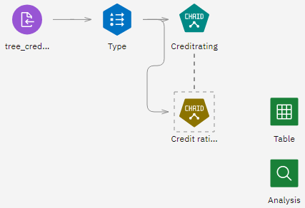
In the CHAID model nugget, the CHAID Tree Model screen includes pages for Model Information, Feature Importance, Top Decision Rules, Tree Diagram, Build Settings, and Training Summary. For example, in Top Decision Rules, you can see details in the form of a rule set—essentially a series of rules that can be used to assign individual records to child nodes based on the values of different input fields.
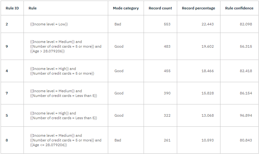
A prediction of Good or Bad is returned for each terminal node in the decision tree—terminal nodes are those tree nodes that are not split further. In each case, the prediction is determined by the mode, or most common response, for records that fall within that node.
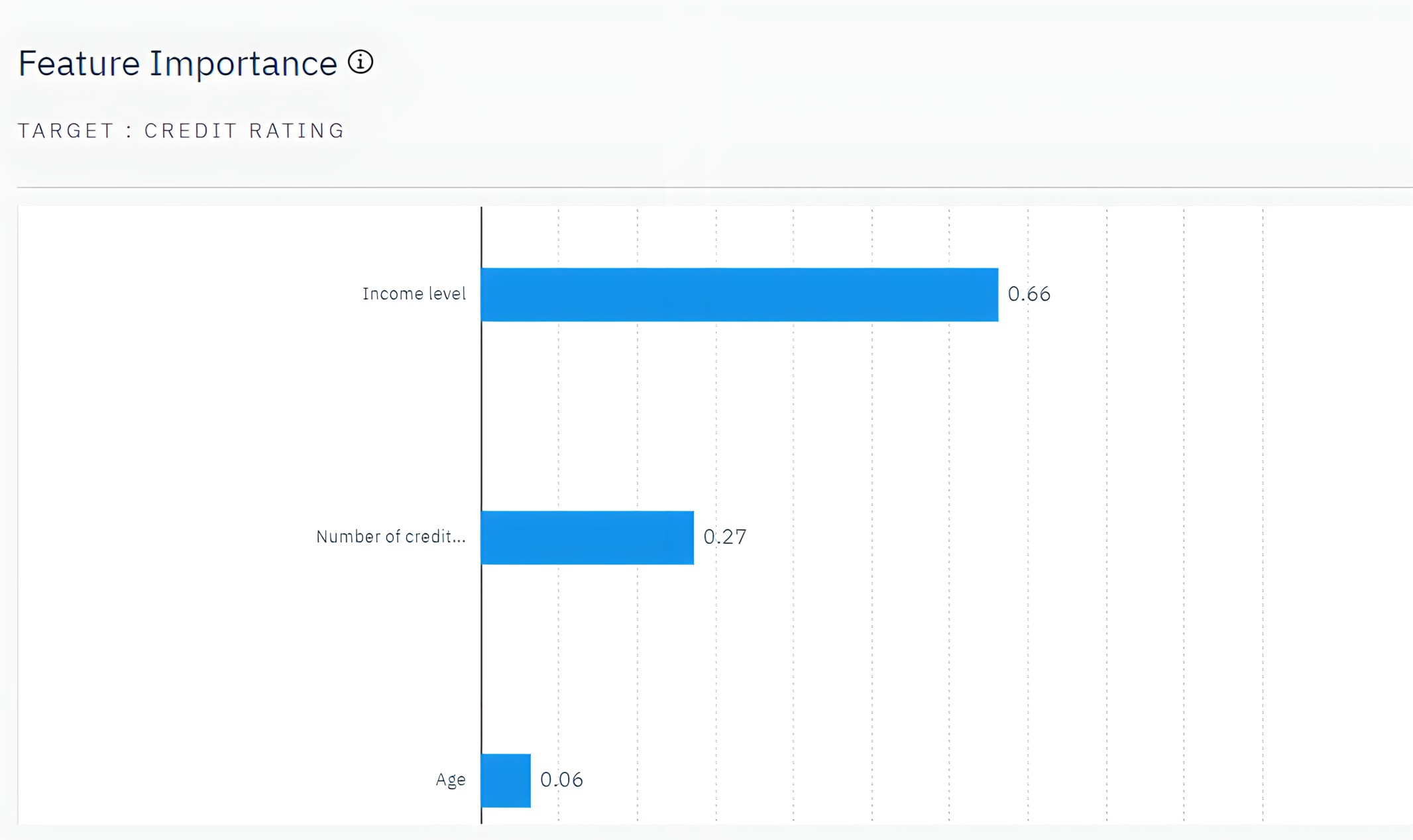
Feature Importance chart
The Feature Importance chart shows the relative importance of each predictor in estimating the model. From this chart, you can see that Income level is easily the most significant in this case, with Number of credit cards being the next most significant factor.
Tree Diagram
The Tree Diagram page displays the same model in the form of a tree, with a node at each decision point. Hover over branches and nodes to explore details.
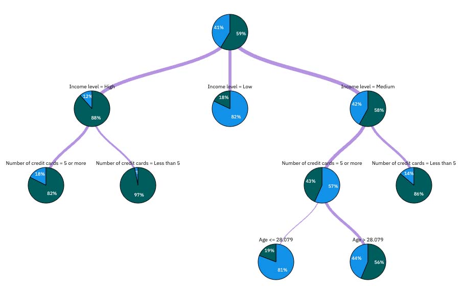
Looking at the start of the tree, the first node (node 0) gives a summary for all the records in the data set. Just over 40% of the cases in the data set are classified as a bad risk. 40% is quite a high proportion, but the tree might give clues as to what factors might be responsible.
The first split is by Income level. Records where the income level is in the Low category are assigned to node 2, and it's no surprise to see that this category contains the highest percentage of loan defaulters. Clearly, lending to customers in this category carries a high risk. However, almost 18% of the customers in this category didn’t default, so the prediction is not always correct. No model can feasibly predict every response, but a good model should allow you to predict the most likely response for each record based on the available data.
In the same way, if you look at the high income customers (node 1), you can see that most customers (over 88%) are a good risk. But more than 1 in 10 of these customers still defaulted. Can the lending criteria be refined further to minimize the risk here?
Notice how the model divided these customers into two subcategories (nodes 4 and 5), based on the number of credit cards held. For high-income customers, if the bank lends to only customers with fewer than five credit cards, it can increase its success rate from 88% to almost 97%—an even more satisfactory outcome.
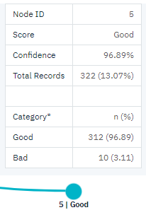
But what about those customers in the Medium income category (node 3)? They’re much more evenly divided between Good and Bad ratings. Again, the subcategories (nodes 6 and 7 in this case) can help. This time, lending only to those medium-income customers with fewer than five credit cards increases the percentage of Good ratings from 58% to 86%, a significant improvement.
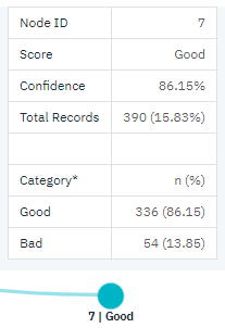
So, you learned that every record that is input to this model is assigned to a specific node. And each node is assigned a prediction of Good or Bad based on the most common response for that node. This process of assigning predictions to individual records is known as scoring. By scoring the same records used to estimate the model, you can evaluate how accurately it performs on the training data—the data for which the outcome is known.