Since many of the data fields are categorical, you can also try plotting a web chart, which maps associations between different categories.

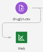
- Place a Web node on the canvas and connect it to the drug1n.csv Data Asset node. Then double-click the Web node to edit its properties.
- Select the fields
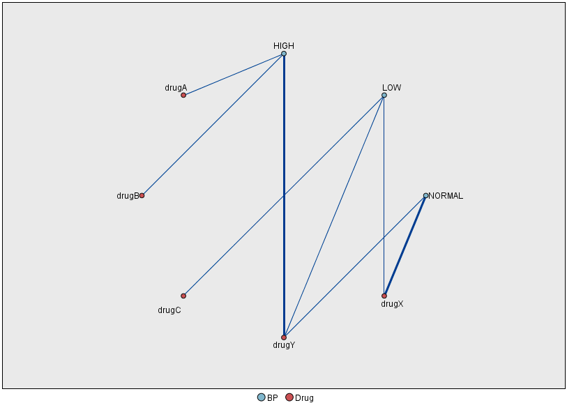
BP(for blood pressure) andDrug. Click Save, then right-click the Web node and select Run. A web chart is added to the Outputs pane.Figure 2. Web graph of drugs vs. blood pressure 
From the plot, it appears that drug Y is associated with all three levels of
blood pressure. This is no surprise; you have already determined the situation in which drug
Y is best.
But if you ignore drug Y and focus on the other drugs, you can see that drugs
A and B are also associated with high blood pressure. And drugs
C and X are associated with low blood pressure. And normal blood
pressure is associated with drug X. At this point, though, you still don't know how
to choose between drugs A and B or between drugs
C and X, for a given patient. This is where modeling can help.