Try the tutorial
In this tutorial, you will complete these tasks:
Sample modeler flow and data set
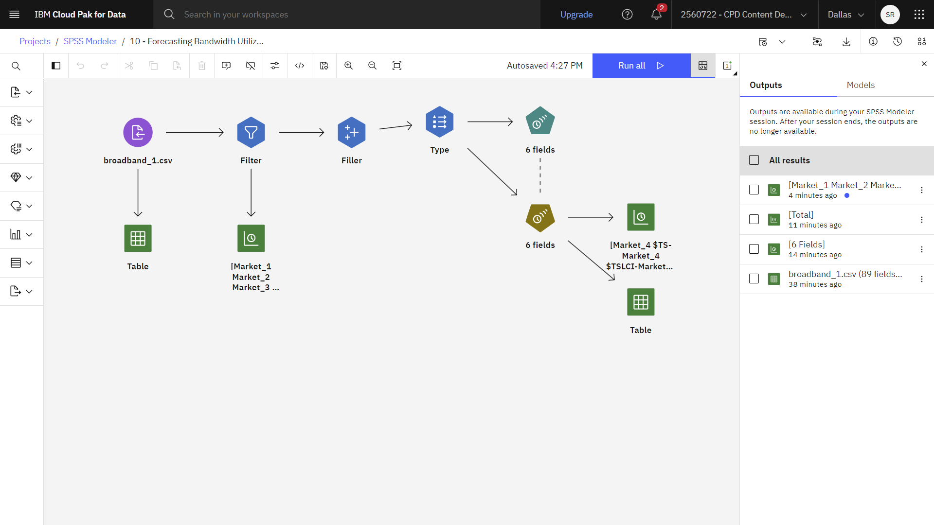
This tutorial uses the Forecasting Bandwidth Utilization flow in the sample project. You use time series modeling to produce forecasts for the next three months for several local markets. The data file used is broadband_1.csv. The following image shows the sample modeler flow.
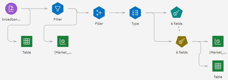
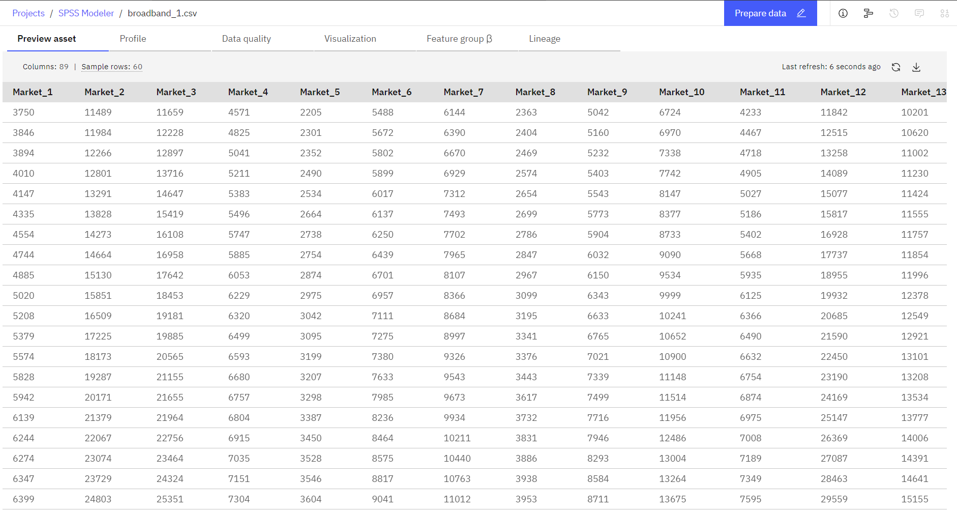
In SPSS® Modeler, you can produce multiple time series models in a single operation. The broadband_1.csv data file has monthly usage data for each of 85 local markets. For the purposes of this example, only the first five series are used; a separate model is created for each of these five series, plus a total.
The file also includes a date field that indicates the month and year for each record. This field is used to label records. The date field reads into SPSS Modeler as a string, but to use the field in SPSS Modeler you convert the storage type to numeric Date format by using a Filler node.
The Time Series node requires that each series is in a separate column, with a row for each interval. SPSS Modeler provides methods for transforming data to match this format if necessary.
Task 1: Open the sample project
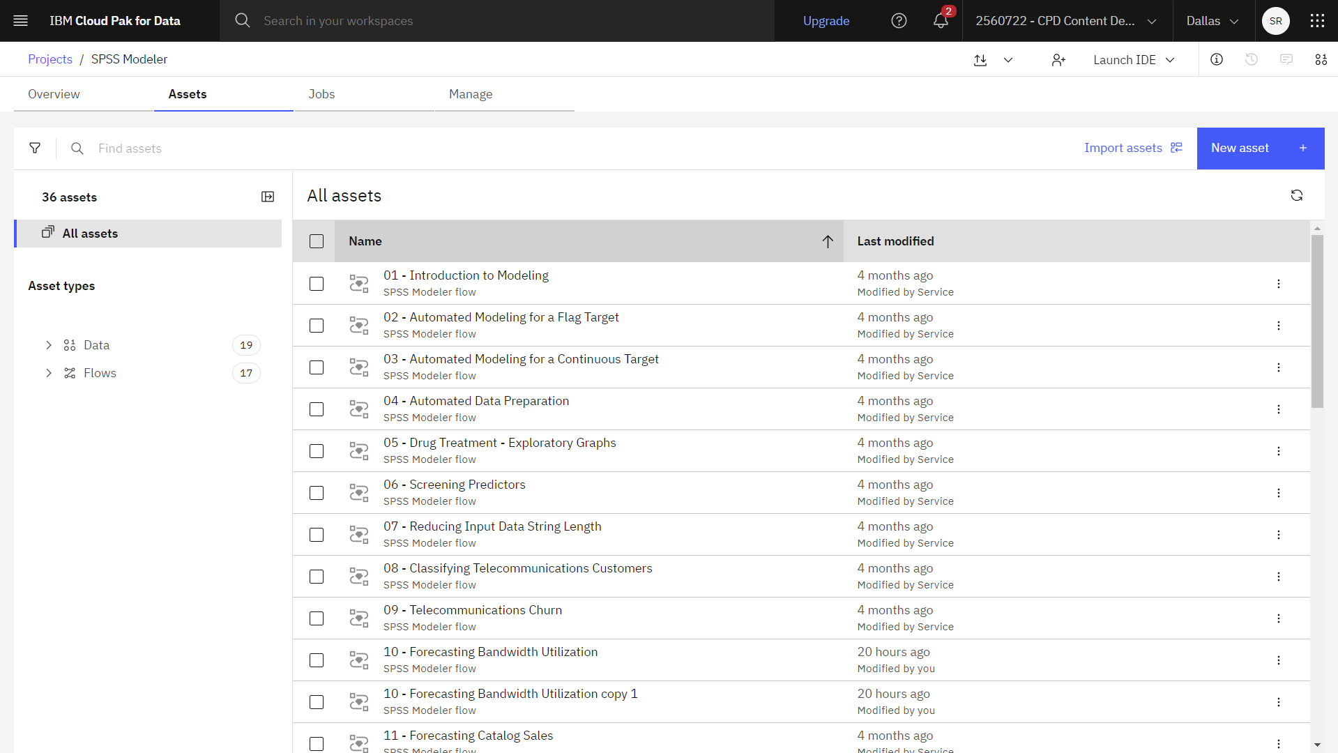
The sample project contains several data sets and sample modeler flows. If you don't already have the sample project, then refer to the Tutorials topic to create the sample project. Then follow these steps to open the sample project:
- In Cloud Pak for Data, from the Navigation menu
, choose Projects > View all Projects.
- Click SPSS Modeler Project.
- Click the Assets tab to see the data sets and modeler flows.
Check your progress
The following image shows the project Assets tab. You are now ready to work with the sample modeler flow associated with this tutorial.
Task 2: Examine the Data Asset and Filter nodes
Forecasting Bandwidth Utilization modeler flow includes several nodes. Follow these steps to examine the Data Asset and Filter nodes:
- From the Assets tab, open the Forecasting Bandwidth Utilization modeler flow, and wait for the canvas to load.
- Double-click the broadband_1.csv node. This node is a Data Asset node that points to the broadband_1.csv file in the project.
- Review the File format properties.
- Optional: Click Preview data to see the full data set.
- Double-click the Filter node. Notice that this node filters out the
Market_6throughMarket_85fields, and theMONTH_andYEAR_fields. - Optional: Click Preview data to see the filtered data set.
Check your progress
The following image shows the Filter node. You are now ready to visualize the data.

Task 3: Visualize the data
It's always a good idea to visualize your data before you build a model. Does the data exhibit seasonal variations? Although SPSS Modeler can automatically find the best seasonal or nonseasonal model for each series, you can often obtain faster results by limiting the search to nonseasonal models when seasonality is not present in your data. Without examining the data for each of the local markets, you can get a rough picture of the presence or absence of seasonality by plotting the total number of subscribers over all five markets. Follow these steps to visualize the data:
- Double-click the [Market_1 Market_2 Market_3 Market_4 Market_5] node. The following image
shows the properties of this Time plot node.
Figure 3. Plot the total number of subscribers 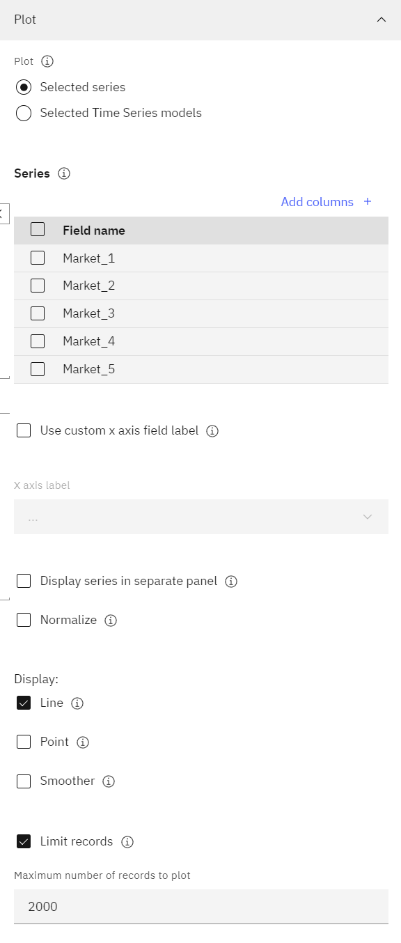
- Graph the total subscription data by adding the
Totalfield to the Series list.- Click Add columns.
- Select the Total field.
- Clear all other fields that begin with
Market_. - Click OK.
- Clear the Display series in separate panel and Normalize options.
- Click Save.
- Hover over the Time Plot node, and click the Run icon
.
- In the Outputs and models pane, click the output results with the name [Total] to
view the graph. The series exhibits a smooth upward trend with no hint of seasonal variations. There
might be individual series with seasonality, but apparently seasonality isn't a prominent feature of
the data in general.
Figure 4. Total subscription data graph 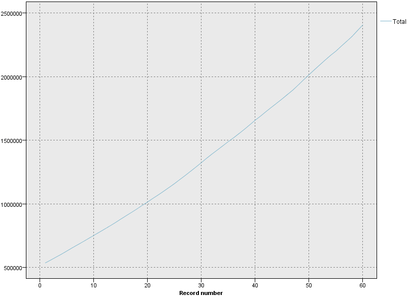
- Graph the data for all markets. Inspect each of the series before you rule out seasonal models.
You can then separate out series that exhibit seasonality and model them separately.
- Double-click the [Total] node.
- Select the Total field, and click the Delete icon.
- Click Add columns.
- Select all fields beginning with
Market_. - Click OK.
- Clear the Display series in separate panel and Normalize options.
- Click Save.
- Hover over the Time Plot node, and click the Run icon
.
- In the Outputs and models pane, click the output results with the name [Market_1
Market_2 Market_3 Market_4 Market_5] to view the graph. Inspection of each of the markets
reveals a steady upward trend in each case. Although some markets are a little more erratic than
others, the results show no evidence of seasonality.
Figure 5. Market subscription data graph 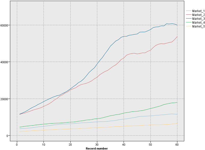
Check your progress
The following image shows the flow. You are now ready to define the dates.
Task 4: Define the dates
Filler nodes are used to replace field values and change storage. You can choose to
replace values based on a specified CLEM condition, such as @BLANK(FIELD).
Alternatively, you can choose to replace all blanks or null values with a specific value.
Filler nodes are often used along with the Type node to replace missing values. Follow
these steps to set the storage type of the DATE_ field to date format:
- Double-click the Filler node to view its properties.
- Notice the
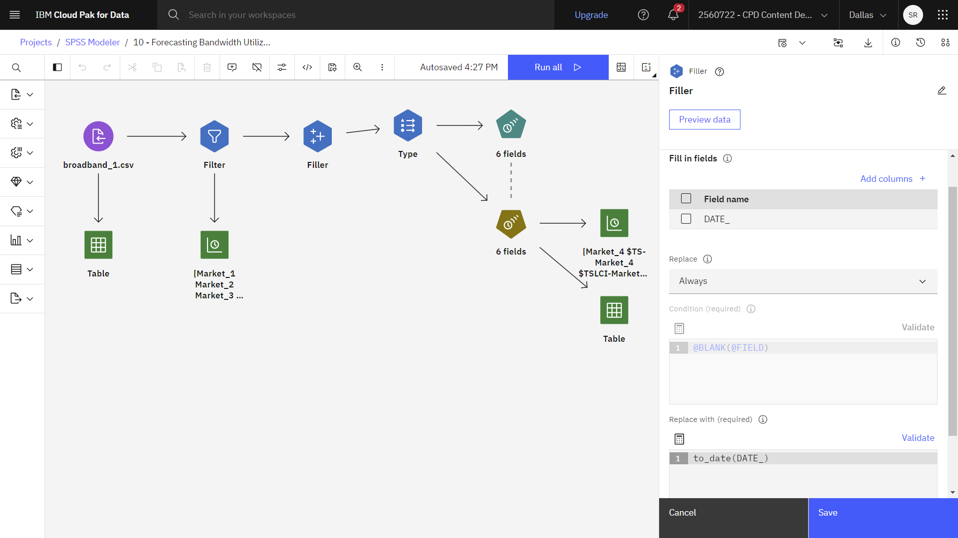
DATE_field is listed in the Fill in fields section. This section includes the fields from the dataset whose values are examined and replaced. - Verify that the Replace option is set to Always. The default behavior is to replace values Based on condition by using the Condition and Replace with expressions.
- Verify that the Replace with value is set to
to_date(DATE_). Since the Replace option is set to Always, the Replace with expression is required. This expression changes the storage type of theDATE_field to date format. - Click Preview data to see the completed
DATE_field. - Click Save.
Check your progress
The following image shows the Filler node. You are now ready to define the targets.
Task 5: Define the targets
You can specify field properties in a Type node. Follow these steps to define the targets in the Type node:
- Double-click the Type node to view its properties.
- Click Read values to read the values from your data source and sets the
field measurement types.
The Role tells modeling nodes whether fields are Input (predictor fields) or Target (predicted fields) for a machine-learning process. Both and None are also available roles, along with Partition, which indicates a field that is used to partition records into separate samples for training, testing, and validation. The value Split specifies that separate models are built for each possible value of the field. - For the
DATE_field, set the role to None. - For all other fields (the
Market_nfields plus theTotalfield), set the role to Target. - Click Save.
Check your progress
The following image shows the Type node. You are now ready to set the time intervals.

Task 6: Set the time intervals
In the Time Series node, you can define the observations that use a Date/Time field with the appropriate time interval. Follow these steps to set the time intervals in the Times Series node:
- Double-click the Time Series (6 fields) node to view its properties.
- Expand the Observations and time interval section. The following options
are available:
- Observations that are specified by a date/time field: You can specify to define the observations by a date, time, or timestamp field. In addition to the field that defines the observations, select the appropriate time interval that describes the observations. Depending on the specified time interval, you can also specify other settings, such as the interval between observations (increment) or the number of days per week.
- Observations that are defined as periods or cyclic periods: Observations are defined by one or more integer fields that represent periods or repeating cycles of periods, up to an arbitrary number of cycle levels. With this structure, you can describe a series of observations that don't fit one of the standard time intervals. For example, a fiscal year with only 10 months can be described with a cycle field that represents years and a period field that represents months, where the length of one cycle is 10.
-
- Verify that
DATE_is selected in the Time/Date field. - Verify that
Monthsis selected in the Time Interval field.
- Verify that
- Expand the Model options section.
- Select the Extend records into the future field. This field sets the number of intervals to forecast beyond the end of the estimation period. The time interval in this case is the time interval of the analysis. When forecasts are requested, auto-regressive models are automatically built for any input series that are not also targets. These models are then used to generate values for those input series in the forecast period.
- Type
3for the number of time intervals.
Check your progress
The following image shows the Type node. You are now ready to build the model.

Task 7: Build the model
With the Time Series node, you can choose to estimate and build exponential smoothing, univariate Autoregressive Integrated Moving Average (ARIMA), or multivariate ARIMA (or transfer function) models for time series, and produce forecasts based on the time series data.
Task 7a: Specify the model options
Follow these steps to specify the model options in the Times Series node:
- Viewing the Time Series (6 fields) node properties, specify the Targets and
Candidate inputs.
- Verify that the Targets table includes all five market fields and the
Totalfield. - Verify that the Candidate inputs table includes all five market fields.
- Verify that the Targets table includes all five market fields and the
- Expand the Build options- general section. The following options are available:
- Exponential smoothing is a method of forecasting that uses weighted values of previous series observations to predict future values. As such, exponential smoothing is not based on a theoretical understanding of the data. It forecasts one point at a time, adjusting its forecasts as new data come in. The technique is useful for forecasting series that exhibit trend, seasonality, or both. You can choose from various exponential smoothing models that differ in their treatment of trend and seasonality.
- ARIMA models provide more sophisticated methods for modeling trend and seasonal components than do exponential smoothing models, and, in particular, they allow the added benefit of including independent (predictor) variables in the model. This approach involves explicitly specifying autoregressive and moving average orders along with the degree of differencing. You can include predictor variables and define transfer functions for any or all of them, as well as specify automatic detection of outliers or an explicit set of outliers.
- Expert Modeler attempts to automatically identify and estimate the best-fitting ARIMA or exponential smoothing model for one or more target variables, thus eliminating the need to identify an appropriate model through trial and error. If in doubt, use the Expert Modeler option.
- Verify that the Expert Modeler method is selected. This method enables the Expert Modeler to decide the most appropriate model to use for each time series.
- Verify that All models is selected in the Model Type field. This option considers both ARIMA and exponential smoothing models.
- Verify that the Expert Model considers seasonal modes field is selected. When this option is selected, the Expert Modeler considers both seasonal and nonseasonal models.
The following image shows the Build options - general settings.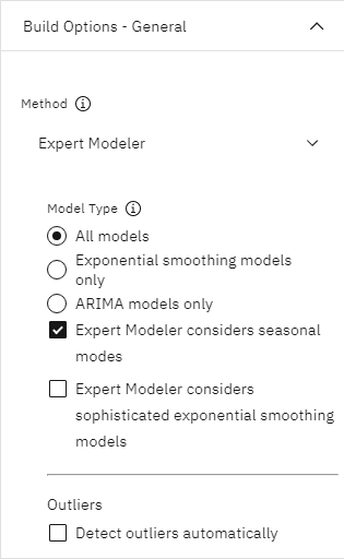
- Click Save.
- Hover over the Time series (6 fields) node, and click the Run icon
.
Task 7b: View the model output
Follow these steps to view the model output in table format:
- Hover over the Table node that is connected to the model nugget, and click the Run
icon
.
- In the Outputs and models pane, click the output results with the name Table to
view the table output.
Notice the three new rows that are appended to the end of the original data. These rows are for the forecast period, in this case January to March 2004.
Figure 6. Table output showing forecasted rows 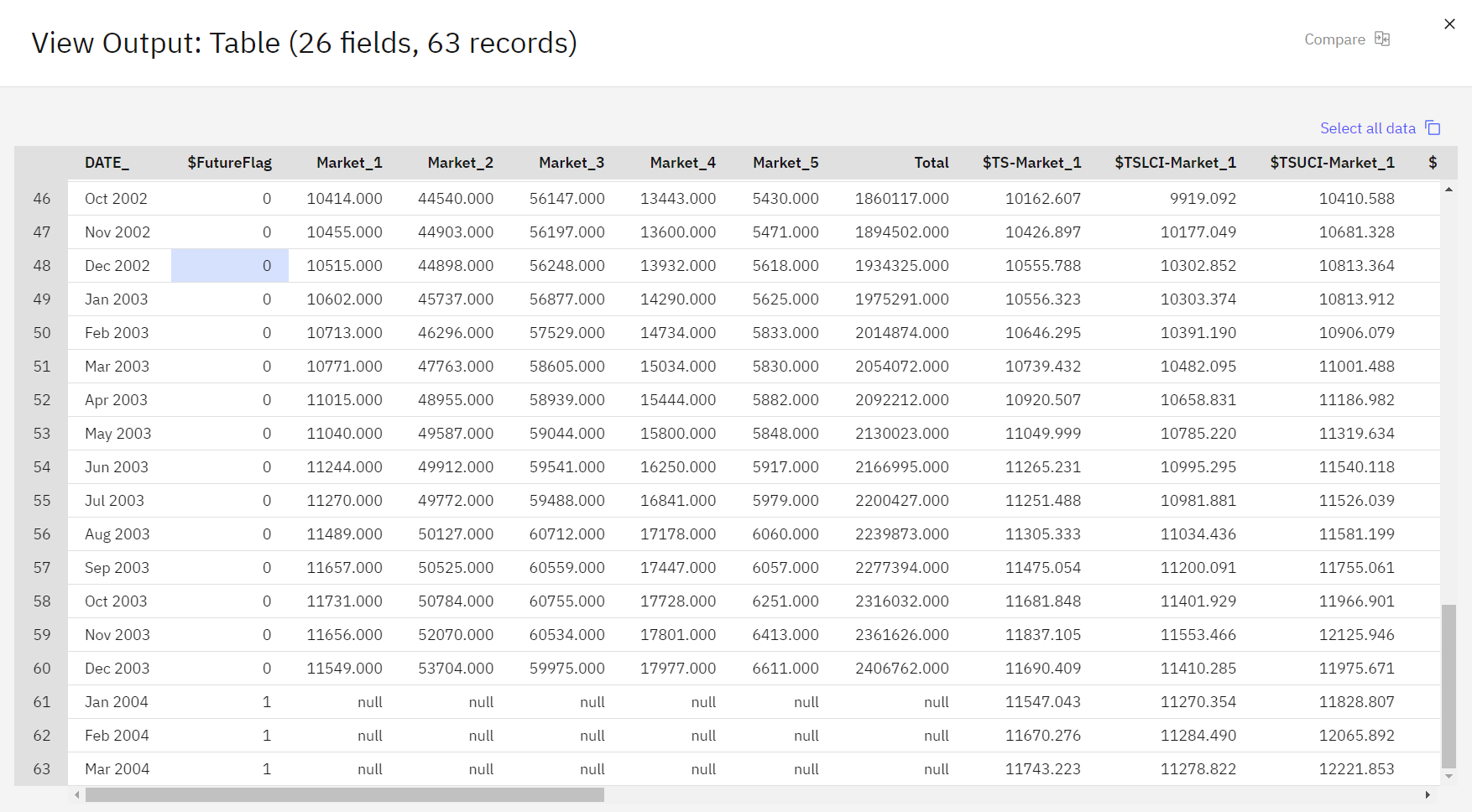
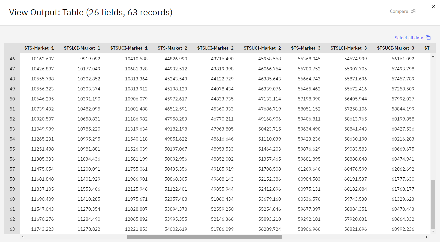
You see several new columns. The Time Series node added
$TS-columns. The columns indicate the following for each row (that is, for each interval in the time series data):Table 1. Generated columns in Time Series mmodel Column Description $TS-colname The generated model data for each column of the original data. $TSLCI-colname The lower confidence interval value for each column of the generated model data. $TSUCI-colname The upper confidence interval value for each column of the generated model data. $TS-Total The total of the $TS-colname values for this row. $TSLCI-Total The total of the $TSLCI-colname values for this row. $TSUCI-Total The total of the $TSUCI-colname values for this row. The most significant columns for the forecast operation are the
$TS-Market_n,$TSLCI-Market_n, and$TSUCI-Market_ncolumns. In particular, these columns in the last three rows contain the user subscription forecast data and confidence intervals for each of the local markets.
Check your progress
The following image shows the output table. You are now ready to examine the model.
Task 8: Examine the model
Now, you are ready to examine the model information and the prediction results.
Task 8a: View the model information
Follow these steps to view the model information:
- Hover over the Time Series model nugget, and click the Overflow menu
.
- In the TARGET column, click Market_2.
- Click Model Information. The Number of Predictors row shows how many fields were
used as predictors for each target.
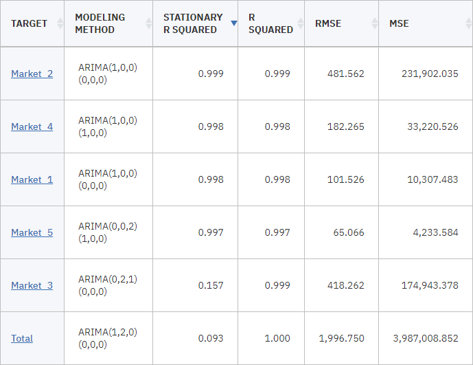
The other rows in the Model Information tables show various goodness-of-fit measures for each model. Stationary R-Squared measures how a model is better than a baseline model. If the final model is ARIMA(p,d,q)(P,D,Q), the baseline model is ARIMA(0,d,0)(0,D,0). If the final model is an Exponential Smoothing model, then d is 2 for Brown and Holt model and 1 for other models, and D is 1 if the seasonal length is greater than 1, otherwise D is 0. A negative stationary R-squared means that the model under consideration is worse than the baseline model. Zero stationary R-squared means that the model is as good or bad as the baseline model and a positive stationary R-squared means that the model is better than the baseline model.
The Statistic and df lines, and the Significance under Parameter Estimates, relate to the Ljung-Box statistic, a test of the randomness of the residual errors in the model. The more random the errors, the better the model is likely to be. Statistic is the Ljung-Box statistic itself, while df (degrees of freedom) indicates the number of model parameters that are available to vary when estimating a particular target.
The Significance gives the significance value of the Ljung-Box statistic, providing another indication of whether the model is correctly specified. A significance value less than 0.05 indicates that the residual errors are not random, implying that there is structure in the observed series that is not accounted for by the model.
Taking both the Stationary R-Squared and Significance values into account, the models that the Expert Modeler chose for
Market_3, andMarket_4are acceptable. The Significance values forMarket_1,Market_2, andMarket_5are all less than 0.05, indicating that some experimentation with better-fitting models for these markets might be necessary.The display shows several goodness-of-fit measures. The R-Squared value gives an estimation of the total variation in the time series that can be explained by the model. As the maximum value for this statistic is 1.0, your models are fine in this respect.
RMSE is the root mean square error, a measure of how much the actual values of a series differ from the values that are predicted by the model, and is expressed in the same units used for the series itself. As this error is a measurement of an error, you want this value to be as low as possible. At first look, the models for
Market_2andMarket_3, while still acceptable according to the statistics you saw so far, are less successful than the models for the other three markets.These additional goodness-of-fit measures include the mean absolute percentage errors (MAPE) and its maximum value (MAXAPE). Absolute percentage error is a measure of how much a target series varies from its model-predicted level, expressed as a percentage value. By examining the mean and maximum across all models, you can get an indication of the uncertainty in your predictions.
The MAPE value shows that all models display a mean uncertainty of around 1%, which is low. The MAXAPE value displays the maximum absolute percentage error and is useful for imagining a worst-case scenario for your forecasts. It shows that the largest percentage error for most of the models falls in the range of roughly 1.8% to 3.7%, again a low set of figures, with only
Market_4being higher at close to 7%.The MAE (mean absolute error) value shows the mean of the absolute values of the forecast errors. Like the RMSE value, this value is expressed in the same units used for the series itself. MAXAE shows the largest forecast error in the same units and indicates the worst-case scenario for the forecasts.
Although these absolute values are interesting, it's the values of the percentage errors (MAPE and MAXAPE) that are more useful in this case, as the target series represent subscriber numbers for markets of varying sizes.
Do the MAPE and MAXAPE values represent an acceptable amount of uncertainty with the models? They are very low. In this situation, business sense comes into play because acceptable risk will change from problem to problem. You assume that the goodness-of-fit statistics fall within acceptable bounds, so move forward to look at the residual errors.
Examining the values of the autocorrelation function (ACF) and partial autocorrelation function (PACF) for the model residuals provides more quantitative insight into the models than simply viewing goodness-of-fit statistics.
A well-specified time series model captures all of the nonrandom variation, including seasonality, trend, and cyclic and other factors that are important. If this is the case, any error should not be correlated with itself (autocorrelated) over time. A significant structure in either of the autocorrelation functions might imply that the underlying model is incomplete.
- Close the Market_2 window.
- Click Model Information. The Number of Predictors row shows how many fields were
used as predictors for each target.
- Click the Market_4 model.
- Click Correlogram to display the values of the autocorrelation function (ACF) and
partial autocorrelation function (PACF) for the residual errors in the model.
Figure 7. Correlogram 
In these plots, the original values of the error variable lag (under BUILD OPTIONS - OUTPUT) up to the default value of 24 time periods and compared with the original value to see any correlation over time. Ideally, the bars that represent all lags of ACF and PACF might be within the shaded area. However, in practice, there might be some lags that extend outside of the shaded area. This situation can result, for example, when some larger lags are tried for inclusion in the model to save computation time. Some lags are insignificant and are removed from the model. If you want to improve the model further and don't care whether these lags are redundant or not, these plots serve as tips for you as to which lags are potential predictors.
Should this situation occur, you need to check the lower (PACF) plot to see whether the structure is confirmed there. The PACF plot looks at correlations after controlling for the series values at the intervening time points.
The values for
Market_4are all within the shaded area, so you can continue and check the values for the other markets. - Close the Market_4 window.
- Click Correlogram to display the values of the autocorrelation function (ACF) and
partial autocorrelation function (PACF) for the residual errors in the model.
- Open the Correlogram for each of the other markets and the totals.
The values for the other markets all show some values outside the shaded area, confirming what you suspected earlier from their Significance values. You need to experiment with some different models for those markets at some point to see whether you can get a better fit, but for the rest of this example, you concentrate on what else you can learn from the
Market_4model. - Close the model windows to return to your flow canvas.
Task 8b: Visualize the predictions
Follow these steps to visualize the predictions:
Plot actual vs forecast
- Double-click the Time Plot node that is connected to the Time Series model nugget.
- Clear the Display series in separate panel option.
- In the Series list, delete all fields except the
Market_4and$TS-Market_4fields. - Click Save.
- Hover over the Time Plot [Market_4 $TS-Market_4 $TSLCI-Market_4 $TSUCI-Market_4] node,
and click the Run icon
.
- In the Outputs and models pane, click the output results with the name [Market_4
$TS-Market_4 $TSLCI-Market_4 $TSUCI-Market_4] to view the graph. Notice how the forecast
(
$TS-Market_4) line extends past the end of the actual data. You now have a forecast of expected demand for the next three months in this market. The lines for actual and forecast data over the entire time series are very close together on the graph, indicating that this model is reliable for this particular time series.Figure 8. Time Plot of actual and forecast data for Market_4 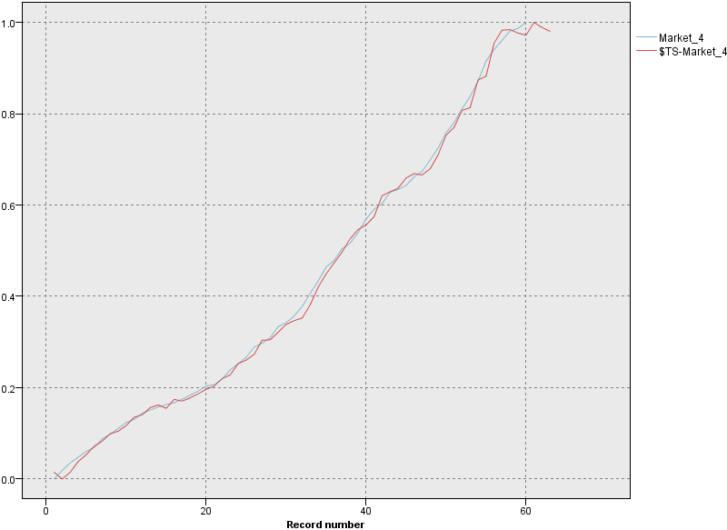
Plot the confidence interval
- Double-click the Time Plot [Market_4 $TS-Market_4 $TSLCI-Market_4 $TSUCI-Market_4] node. You have a reliable model for this particular market, but what margin of error does the forecast have? You can get an indication of the margin of error by examining the confidence interval.
- In the Series section, delete the
Market_4and$TS-Market_4fields. - Click Add columns.
- Select the
$TSLCI-Market_4and$TSUCI-Market_4fields. - Click OK.
- Select the
- Click Save.
- Hover over the Time Plot [Market_4 $TS-Market_4 $TSLCI-Market_4 $TSUCI-Market_4] node,
and click the Run icon
.
- In the Outputs and models pane, click the output results with the name [Market_4
$TS-Market_4 $TSLCI-Market_4 $TSUCI-Market_4] to view the graph. Now, you have the same graph as
before, but with the upper (
$TSUCI) and lower ($TSLCI) limits of the confidence interval added. Notice how the boundaries of the confidence interval diverge over the forecast period, indicating increasing uncertainty as you forecast further into the future. However, as each time period goes by, you have another (in this case) month's worth of actual usage data on which to base your forecast. In a real-world scenario, you might read the new data into the flow and reapply your model now that you know it's reliable.Figure 9. Time Plot with confidence interval added 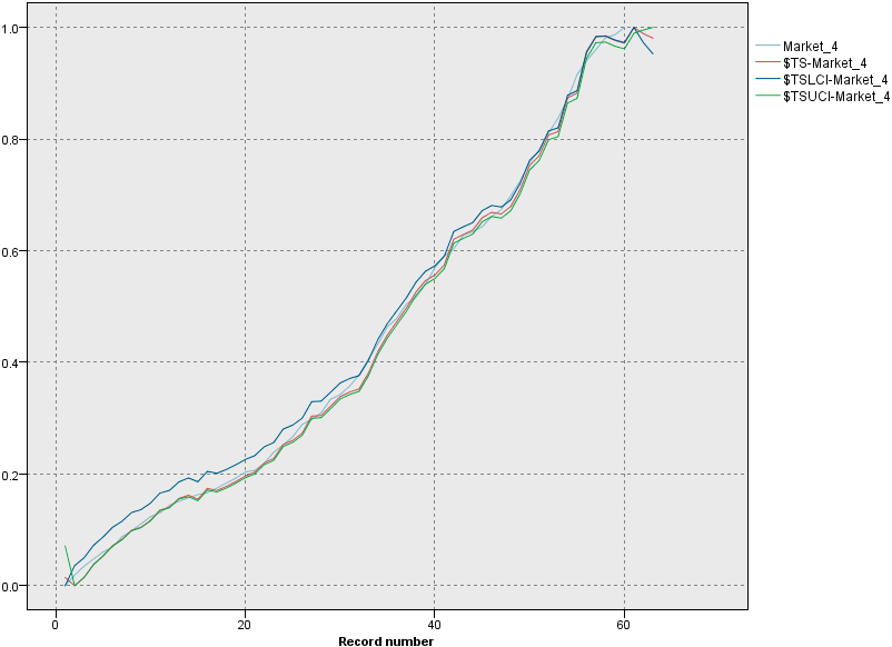
- Close the graph window.
Check your progress
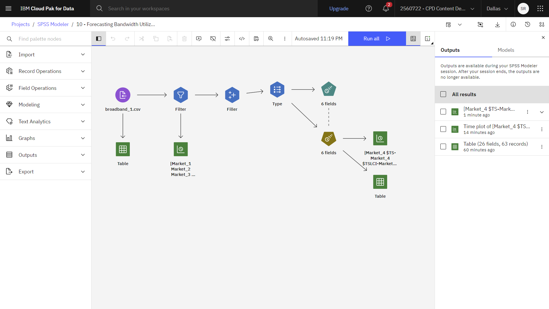
The following image shows the completed flow.
Summary
This example showed you how to use the Expert Modeler to produce forecasts for multiple time series. In a real-world scenario, you might now transform nonstandard time series data into a format suitable for input to a Time Series node.
Next steps
You are now ready to try other SPSS Modeler tutorials.