You can discover insights from your data by creating visualizations. By exploring data from different perspectives with visualizations, you can identify patterns, connections, and relationships within that data and quickly understand large amounts of information.
- Required service
- watson.ai Studio or IBM Knowledge Catalog
- Data format
- Tabular: Avro, CSV, JSON, Parquet, TSV, SAV, Microsoft Excel .xls and .xlsx files, SAS, delimited text files, and connected data.
For more information about supported data sources, see Connectors.
- Data size
- No limit
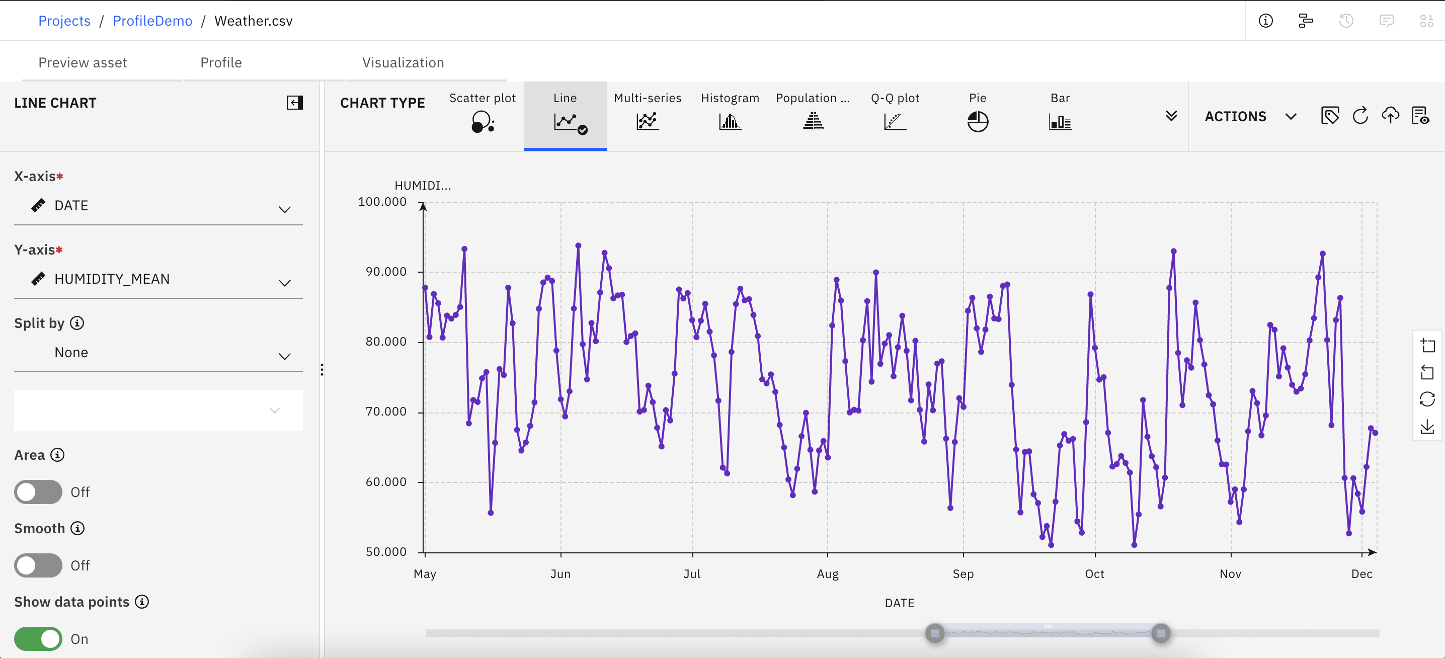
You can create graphics similar to the following example that shows how humidity values vary over time.

Creating visualizations
You can build a chart by selecting a predefined chart type from the Visualization tab.
To create visualizations that use an asset from your project:
- On the Assets tab of your project, click Data asset in the list of asset types, and select a data asset.
- Click the Visualization tab.
- Start with a chart or select columns. Select a chart and input your
preferences in the DETAILS pane that opens.
If you select columns first, the available charts are ordered starting with the most relevant, based on the selected columns. The best charts for your data are indicated with a dot next to the chart name. Depending on your chosen data, only charts and columns that support those data types are available.
As you build the chart, the canvas displays a preview of the chart with variable labels and measurement levels that are taken from your data.
If you close the data asset, or switch from the Visualization tab, your created charts are not saved in the data asset.
- Select ACTIONS > Save visualization to project to save your
visualization. Select Create a new asset or
Append to existing asset. Provide a visualization asset name, an optional
description, and a chart name, and click Apply.
Your saved asset is listed under Visualizations in your project. You can create different charts for the same data asset and save them individually, or append them to the same visualization asset in your project.
Saved visualizations in a project
You can view or edit visualizations in a project, by clicking the name of the visualization asset in the Visualizations of your project.
On the Layout tab of your visualization asset, you can arrange a layout of multiple charts based on the same data asset and generate an output in PDF format or through an HTML link. You can download the PDF file or obtain the HTML link from the Output tab.
Graphical charts are generated based on a sample data set of up to 5,000 records.
- Edit the visualization asset in the Chart tab.
- Select MODIFY CHART SETTINGS.
- Make a change to a chart setting to activate the Save button.
- Click Save.
You can also add more charts in this way to the visualization asset and save them in the project, without having to reopen the data asset.
If you create a visualization asset and then delete the corresponding data asset, the visualization asset still appears in your project, but uses sample data. You can see the data schema of the original data set in the Data tab. You can then select a new data source that uses the same schema by clicking Select from project. If no data asset with this schema exists in your project, the visualization asset remains with only sample data in your project and cannot be modified. If you select a new data asset with the same schema, you must then refresh the visualization asset by editing the chart settings, and saving it again.
The Profile tab shows you Audit and Quality information about the columns of your data set.
- Minimum and maximum values
- Mean
- Standard deviation
- Skewness
- Number of unique values
On the Quality tab you can see, for example, outliers or the numbers of empty values for each column of your data.
You can also create Pearson correlations and descriptive statistics, including frequencies, by clicking icons in the Profile toolbar.
If you export a project, visualization assets, if selected, are also exported.