You can display more than one scenario on a page in the Visualization view to compare and validate your model and data.
About this task
Procedure
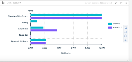
For example, to display bar charts for two scenarios in the Visualization view:
- Click Chart and configure it by clicking the pencil icon.
-
In the Chart Widget Editor, expand the Select scenario menu, and choose
Scenario
1
(assuming that your current scenario isScenario 2) so that you have both scenario 1 and scenario 2 listed. -
In the
Tablefield, select theSolution dataoption and selectsolutionfrom the drop-down list. -
In the bar chart pane, select
Descendingfor theCategory order,Y-axisfor theBar typeand click OK to close the Chart Widget Editor. A second bar chart is then displayed showing you the solution results for scenario 2. -
Re-edit the chart and select
@Scenarioin theSplit byfield of the Bar chart pane.
Results
You then obtain both scenarios in the same bar chart:

You can select many different types of charts in the Chart Widget Editor.
Example
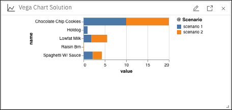
To display bar charts for two scenarios using the Vega Chart widget, you
can similarly choose to display the same data, select
value, and name in both the x and y fields in the
Chart section of the Vega Chart
Widget Editor. Then, in the Mark
section, select @Scenario for the color field. This selection
gives you the following bar chart with the two scenarios on the same y-axis, distinguished by
different colors.

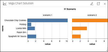
If you re-edit the chart and select @Scenario for the column facet, you obtain the two scenarios in separate charts side by side as follows:

You can use many different types of charts that are available in the Mark field
of the Vega Chart Widget Editor.
You can also select the JSON tab in all the widget editors and configure your charts by using the JSON code. A more advanced example of JSON code is provided in the Vega Chart widgets in Decision Optimization experiments section.