About cookies on this site Our websites require some cookies to function properly (required). In addition, other cookies may be used with your consent to analyze site usage, improve the user experience and for advertising. For more information, please review your options. By visiting our website, you agree to our processing of information as described in IBM’sprivacy statement. To provide a smooth navigation, your cookie preferences will be shared across the IBM web domains listed here.
Last updated: Apr 18, 2024
You can display more than one scenario on a page in the Visualization view to compare and validate your model and data.
About this task
Procedure
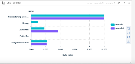
For example, to display bar charts for two scenarios in the Visualization view:
- Click Chart and configure it by clicking the pencil icon.
-
In the Chart Widget Editor, expand the Select scenario menu, and choose
Scenario 1Scenario 2 -
In the
TableSolution datasolution -
In the bar chart pane, select
DescendingCategory orderY-axisBar type -
Re-edit the chart and select
@ScenarioSplit by
Results
You then obtain both scenarios in the same bar chart:
You can select many different types of charts in the Chart Widget Editor.
Example
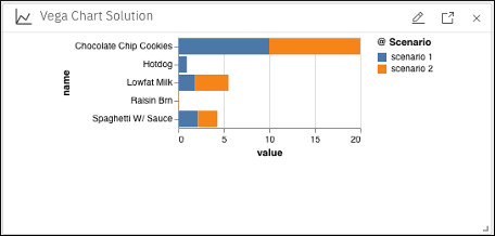
To display bar charts for two scenarios using the Vega Chart widget, you
can similarly choose to display the same data, select
value, and name in both the xyChartMark@Scenariocolor
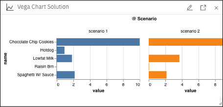
If you re-edit the chart and select @Scenario for the column facet, you obtain the two scenarios in separate charts side by side as follows:
You can use many different types of charts that are available in the Mark
You can also select the JSON tab in all the widget editors and configure your charts by using the JSON code. A more advanced example of JSON code is provided in the Vega Chart widgets in Decision Optimization experiments section.