With the Decision Optimization experiment Visualization view, you can configure the graphical representation of input data and solutions for one or several scenarios. You can thus compare different scenarios to validate models and business decisions.
The Visualization view is common to all scenarios in a Decision Optimization experiment.
- Notes
- Tables
- Charts
- Vega charts
- Gantt charts
- Pivot tables
You can edit these widgets using the Widget Editor.
Visualization pages
You can use pages in the Visualization view to better organize your visualizations, for example to separate input and solution data.
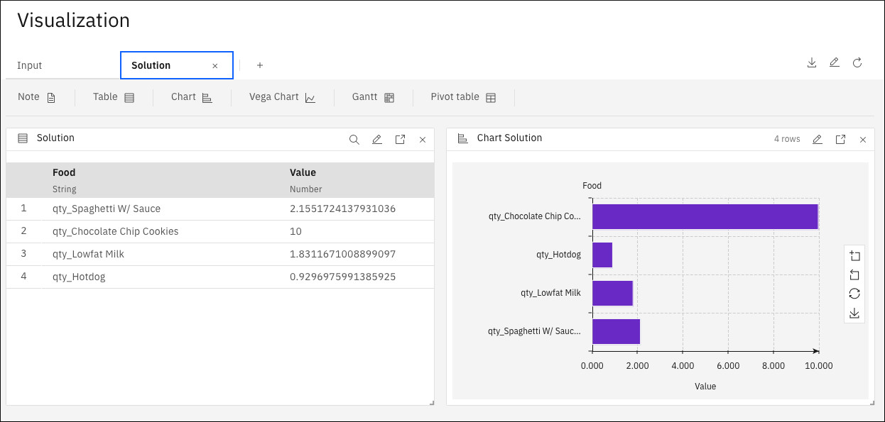
For example, the following image shows a table and a bar chart that appears in the solution tab.
To add pages in the Visualization view, click the plus sign. You can then customize what is displayed on each page. You can also edit the page name by double-clicking the tab on the page.
You can create different pages for different scenarios or combine scenarios on the same page.
To edit a page, click the Edit Dashboard (pencil) icon at the page level. In the Visualization Editor that opens, you can edit the page name, reorder, and add pages.
To delete a page, click the delete button on the page tab or in the Visualization Editor.